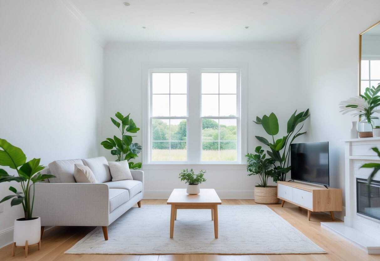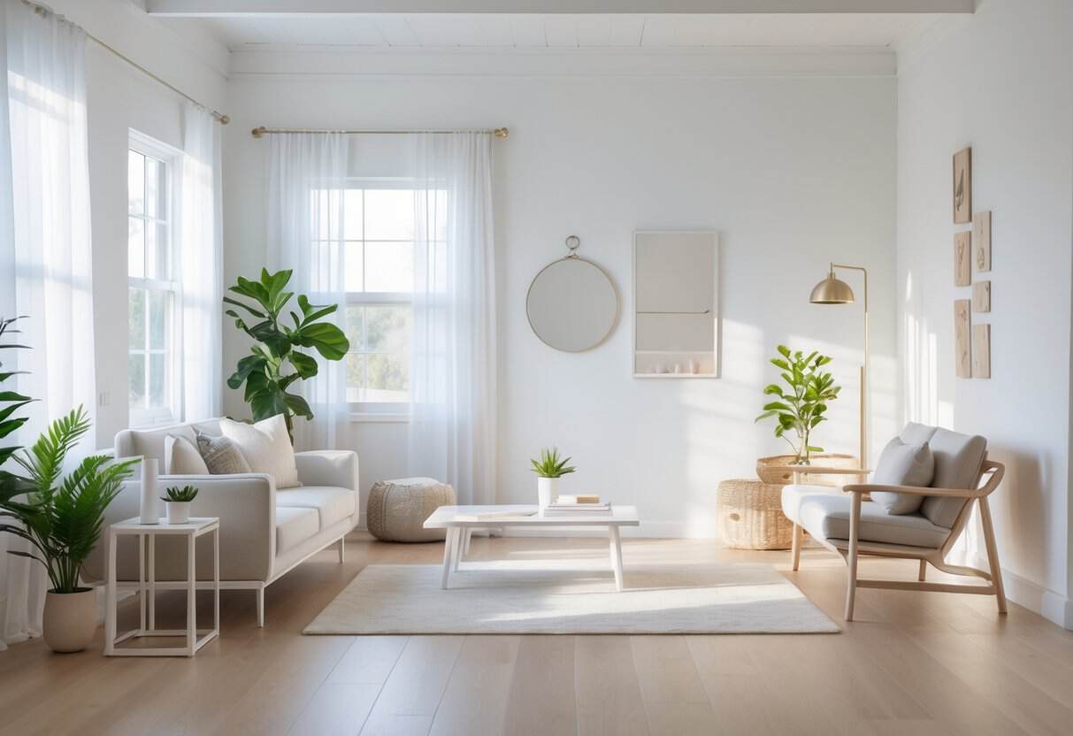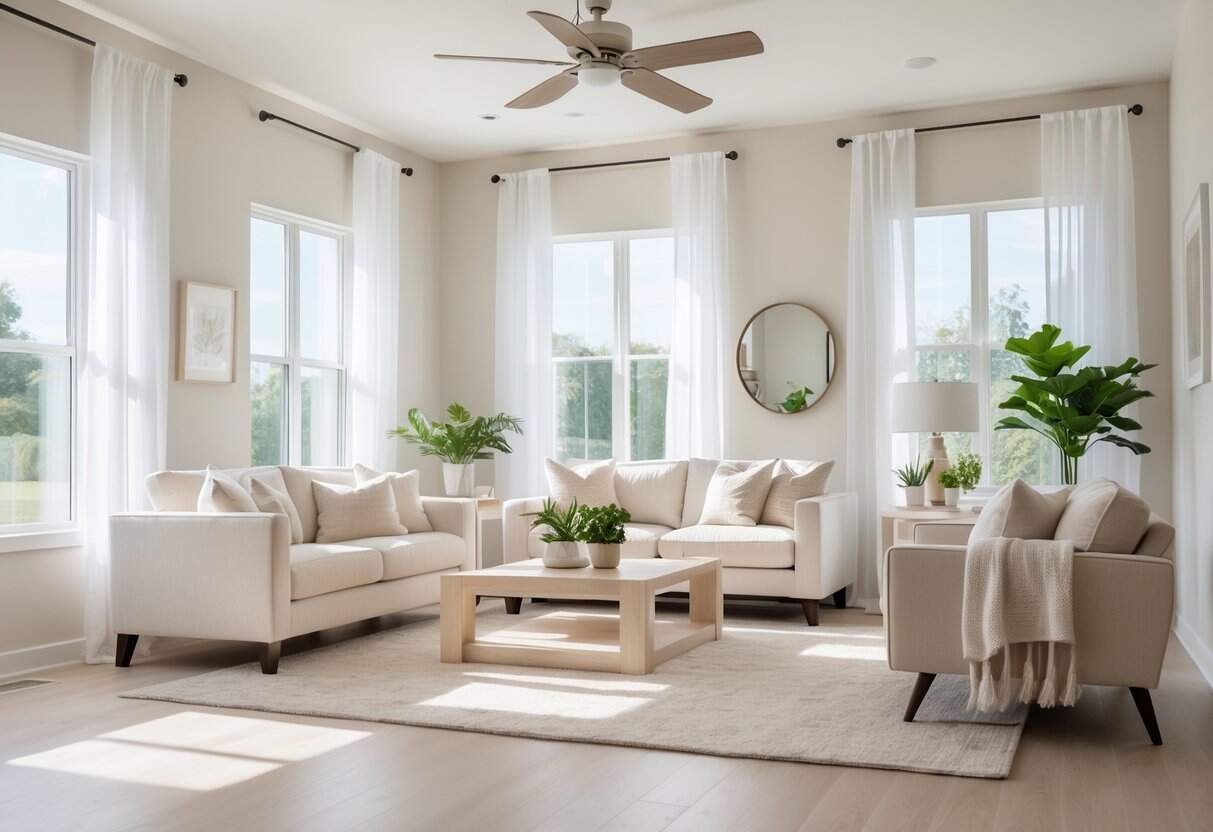
Westhighland White offers a soft, creamy shade that adds warmth without leaning too yellow. It works well in both dim and bright spaces, making rooms feel balanced and inviting. This versatile color adapts easily to different styles, whether the goal is a cozy bedroom, a fresh kitchen, or a welcoming hallway.
Its ability to blend with both cool and warm tones makes it a reliable choice for many interiors. When paired with the right trim and furnishings, it creates a clean backdrop that highlights décor while keeping the overall look cohesive. For comparison, you might also explore my guide to Swiss Coffee Sherwin Williams: Timeless Warm White for Any Space to see how different warm whites perform in similar settings.
Key Takeaways
- This color provides a warm yet balanced backdrop
- It works well with a variety of room styles and lighting
- Coordinating trim and décor enhances its effect
Paint Color Basics of Westhighland Whites
Key Terms for This Shade
Westhighland White falls into the light color category because its Light Reflectance Value (LRV) is 86, which means it reflects a high amount of light. For comparison:
- Pure white has an LRV close to 90
- Black has an LRV of 0
Technical details:
| Property | Value |
|---|---|
| LRV | 86 |
| RGB | 243, 238, 227 |
| Hex Code | #F3EEE3 |
These numbers show that the paint leans toward a soft, light tone rather than a stark white.
Subtle Hues in Westhighland White
This shade has cool undertones with hints of blue and gray. These undertones keep the color crisp while avoiding the yellow or creamy look found in warmer whites.
The paint creates a light, open feel that works well in bright rooms. It balances freshness with softness, so it does not appear harsh.
Because of its neutrality, it pairs well with both warm woods and cool accents, making it easy to use across different styles. Because of its neutrality, it pairs well with both warm woods and cool accents, making it easy to use across different styles. For those seeking a darker but equally versatile companion, see my Sherwin Williams Peppercorn SW 7674 review, which offers a bold contrast option against Westhighland White’s softness.
How Neutral Tones Affect Spaces
Neutral whites like this one often bring a sense of calm and order. The brightness helps rooms feel larger and cleaner, while the cool base supports focus and clarity.
This shade also highlights other colors in a room, allowing decor and furniture to stand out. Its reflective quality increases natural light, which can make spaces feel more welcoming and open.
Why Select Westhighland White?

Adaptability
Westhighland White shifts gently with the lighting. In daylight, it appears bright and clean, while under artificial light, it takes on a cooler tone. This balance makes it useful in many design styles, from modern to traditional.
Main Qualities
This shade helps rooms feel larger and more open. It works well as a neutral backdrop that highlights furniture, art, and décor. Unlike colder whites or heavy creams, it stays fresh and clear without feeling harsh.
Highlights:
- Expands visual space
- Provides a crisp, balanced base
- Works across décor styles
Long-Lasting Finish
When used in premium paint lines, this color provides excellent coverage and resistance to wear. It stays bright with little upkeep, even in areas that see frequent use. Its reflective quality also helps keep spaces looking light and clean.
Surface Effects
Westhighland White reflects light in a way that defines details and adds depth. Its subtle undertones prevent flatness, giving walls a clear, structured look. This creates an environment that feels bright and orderly.
Westhighland White Room Guide

Shared Spaces and Open Layouts
Westhighland White works well in large, connected areas because it reflects light and creates a sense of flow. Its bright tone helps furniture and accents stand out without making the space feel crowded.
Pairing ideas:
- Trim: Pure White SW 7005 for crisp borders
- Adjacent walls: Site White SW 7070 for subtle variation
| Feature | Effect |
|---|---|
| Light reflection | Expands brightness |
| High LRV | Enhances openness |
| Neutral base | Highlights décor |
Bedrooms and Restful Corners
This shade brings calm and clarity to bedrooms, making them feel clean and uncluttered. Its soft undertones lean toward blue-gray, which supports a soothing mood while staying flexible for different styles.
To add depth, layer fabrics such as throws, pillows, or rugs in muted tones. The result is a balanced space that feels both modern and welcoming.
Tips:
- Use on all walls for consistency
- Add textured linens for warmth
- Pair with muted accents for harmony
Kitchens and Cooking Areas
In kitchens, Westhighland White offers a polished look when applied to cabinets or walls. A semi-gloss finish enhances durability and keeps surfaces bright.
This color works with both wood and stone, making it easy to mix materials. It also creates a neutral backdrop for bold hardware or colorful accessories.
Best uses:
- Cabinets with a semi-gloss coat
- Walls that need light enhancement
- Spaces with mixed materials
Bathrooms and Relaxing Retreats
Bathrooms benefit from the clean, fresh quality of Westhighland White. It makes small rooms feel larger and pairs well with a variety of fixtures.
Chrome, matte black, and brushed finishes all stand out against its crisp surface. For variety, it can be used on every wall or combined with patterned tile for a focal point.
Options to consider:
- Full wall coverage for brightness
- Accent tiles for balance
- Neutral base for fixture highlights
Pairings for Westhighland White (SW 7566)

Coordinating Highlight Shades
Westhighland White works well with tones that either echo its warmth or provide gentle contrast. Using the right accent shades can bring balance and variety to a space without overwhelming its soft character.
Suggested Options:
| Shade | Code | Effect |
|---|---|---|
| Natural Tan | SW 7567 | Extends the creamy base of Westhighland White while adding subtle depth. |
| French Moire | SW 9056 | Introduces a cool blue-green contrast that refreshes and balances the warm backdrop. |
These accents help define areas while keeping the overall look cohesive and inviting.
Creating Cohesive Color Schemes with Westhighland White (SW 7566)

1. Single-Tone Approach
Using Westhighland White as the base, pair it with Creamy (SW 7012) on ceilings for a smooth flow. Add Ivory Lace (SW 7013) on details and Nacre (SW 6154) for gentle contrast. This keeps the palette light while adding layers of interest.
2. Cool-Toned Palette
Apply Westhighland White to walls and trim, then bring in Rainwashed (SW 6211) for shared spaces. Use Quietude (SW 6212) as an accent and Silver Strand (SW 7057) in bathrooms. Together, these shades create a calm, refreshing look.
3. Blended Warm and Cool Tones
Start with Westhighland White in main rooms. Add Natural Tan (SW 7567) for warmth, Loggia (SW 7506) for accents, and Smoky Salmon (SW 6331) in smaller areas. This mix balances cozy and airy tones.
4. Nature-Inspired Palette
Combine Westhighland White on walls with Extra White (SW 7006) for trim and ceilings. Use French Moire (SW 9056) in connecting areas and Greens (SW 6748) for furniture or highlights. This approach ties the space to natural surroundings.
Coordinating with Furniture and Decor
Matching Wood Finishes
This shade works well with a wide range of wood tones. Medium woods such as oak, cherry, and pecan highlight its warm qualities and create a balanced look. For a stronger contrast, darker woods like ebony or wenge add clear definition. Lighter options such as maple or birch keep the space bright and modern while still showing warmth.
| Wood Tone | Effect with Wall Color |
|---|---|
| Medium (oak, cherry, pecan) | Adds warmth and balance |
| Dark (ebony, wenge) | Creates bold contrast |
| Light (maple, birch) | Keeps the look airy and fresh |
Pairing with Metal Finishes
Metals can shift the overall feel of the room. Brass and copper blend smoothly with the creamy base, giving a welcoming look. Matte black offers sharp contrast, adding structure and depth. Bronze or aged finishes bring a more classic style that feels grounded and timeless.
Adding Decorative Elements
Soft textures like wool, bouclé, or sisal bring comfort and visual interest. Natural accents such as terracotta, stone, or clay pieces introduce earthy tones that work well with the neutral backdrop. Artwork with gentle landscapes, trailing greenery, or honey-colored wood details adds warmth and completes the setting.
Ideal Substitute for Westhighland White (SW 7566)
Those who like the soft warmth of Westhighland White but want slight variations have several reliable choices. Each option keeps a light, inviting look while offering different undertones to match specific styles and settings.
Notable alternatives include:
- SW 7005 Pure White – A brighter white with fewer yellow tones. It delivers a clean, crisp appearance without feeling too stark, making it a good fit for modern spaces.
- SW 7008 Alabaster – A warm off-white that feels soft and calm. Its subtle neutrality makes it useful for creating relaxed, timeless rooms.
- SW 7634 Pediment – A white with greige influence that adds more depth. It works well for layered interiors with a touch of sophistication.
- SW 7647 Crushed Ice – A cooler white with gray undertones. This choice suits spaces that benefit from a contemporary, refreshing look.
- SW 7671 On the Rocks – A balanced white with gray-beige tones. It maintains a gentle character while adapting well to different lighting conditions.
| Paint Color | Undertone | Style Benefit |
|---|---|---|
| Pure White | Minimal yellow | Crisp, modern |
| Alabaster | Neutral warmth | Relaxed, timeless |
| Pediment | Greige mix | Refined depth |
| Crushed Ice | Cool gray | Fresh, contemporary |
| On the Rocks | Gray-beige | Versatile, balanced |
Frequently Asked Questions
What is the light reflectance value of West Highland White?
West Highland White (SW 7566) has a Light Reflectance Value (LRV) of 86. This means it reflects a high amount of light, making it a bright and airy white without being stark.
Can West Highland White work for both inside and outside surfaces?
Yes, this shade can be used on both interior and exterior projects. Indoors, it creates a soft and welcoming backdrop. Outdoors, it stays bright but not too harsh in natural light.
Which color palettes go well with West Highland White?
West Highland White pairs well with:
- Warm neutrals like beige or taupe
- Earth tones such as soft browns or greens
- Muted blues and grays for a balanced look
Using it with darker accents can also add contrast and depth.
How does West Highland White differ from Pure White?
- West Highland White: Warmer, with subtle creamy undertones
- Pure White (SW 7005): Cleaner and more neutral, with less warmth
Those wanting a softer, cozier white often choose West Highland White, while Pure White works for a crisp and modern look.
What undertones does West Highland White have?
This color leans warm with creamy undertones. It does not appear yellow but has a softness that prevents it from looking cold or stark.
Is West Highland White a good option for trim and molding?
Yes, it can be used for trim, molding, and doors. However, many choose a crisper white, like Pure White, for trim to create contrast. Using West Highland White for both walls and trim gives a more seamless and uniform look.
