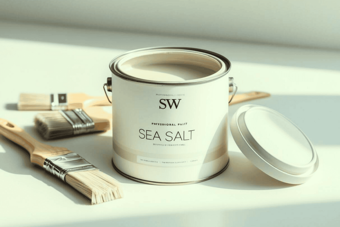
Sea Salt by Sherwin-Williams has gained attention for its subtle blend of green and blue tones that shift with the light. This quality allows it to create a calming environment while still offering variety throughout the day. Many homeowners find it versatile enough to enhance both casual and more refined spaces.
Its ability to adapt makes it a practical option for different styles and rooms. From kitchens to bedrooms, the shade can complement a range of décor choices while maintaining a balanced look. Understanding how it interacts with lighting, furnishings, and other colors helps determine where it works best.
Key Takeaways
- The color creates a calm and adaptable atmosphere.
- Its appearance shifts with lighting and surroundings.
- It pairs well with a wide range of design elements.
The Deep Undertones that Make Sea Salt Stand Out
Sea Salt carries a balance of green, gray, and blue that shifts depending on the light in a space. This layered mix gives it a depth that feels adaptable without being overwhelming. Its ability to change throughout the day makes it a reliable choice for different settings.
In strong daylight, the green influence comes forward. This creates a clean and lively backdrop that works well in kitchens, bathrooms, or work areas. The freshness of this tone helps a room feel open and energizing.
As the light softens in the afternoon or evening, the cooler blue and gray notes become more noticeable. These undertones create a calm and restful effect that suits bedrooms or living rooms. The transition between warm daylight and artificial lighting highlights its versatility.
When applied to walls, Sea Salt rarely looks the same from one angle to another. A wall near a window may display a stronger green, while shaded corners lean toward blue-gray. This subtle variation adds dimension without distracting from the rest of the décor.
The following details provide a closer look at its measurable qualities:
| Detail | Value | Notes |
|---|---|---|
| Paint Name | Sea Salt | Sherwin-Williams signature shade |
| Color Code | SW 6204 | Official catalog number |
| LRV | 63 | Reflects a moderate amount of light |
| RGB | 205 / 210 / 202 | Digital screen match |
| Hex Code | #CDD2CA | Web design equivalent |
This color’s strength lies in its ability to remain gentle yet dynamic. It does not dominate a room but instead shifts with the environment. That quality makes it a dependable option for those who want a background that adapts naturally to changing light.
How Does Sea Salt Influence the Atmosphere of a Room?

Sea Salt often introduces a sense of calm that makes a space feel more open and breathable. Its soft tones allow walls to visually recede, which can reduce the feeling of confinement in smaller rooms. This quality makes it a useful choice for areas where a lighter, more spacious impression is desired.
The color also balances coolness without creating a harsh or sterile effect. Instead, it provides a refreshing backdrop that resembles the quiet ease of being near water. This makes it versatile for living spaces, bedrooms, or any area where relaxation is a priority.
One of its defining features is how it shifts with natural light.
- Morning light: soft green notes create a fresh, clean effect.
- Afternoon light: subtle blue undertones emerge, adding calm.
- Evening light: the overall tone deepens, supporting a restful mood.
This adaptability means the room does not remain fixed in a single tone throughout the day. Instead, it subtly changes, aligning with daily routines and natural rhythms.
| Time of Day | Dominant Tone | Effect on Space |
|---|---|---|
| Morning | Green hues | Fresh, uplifting |
| Afternoon | Blue hues | Quiet, soothing |
| Evening | Muted blend | Restful, relaxed |
By shifting with the light, Sea Salt helps create a setting that feels both consistent and dynamic, encouraging comfort at any hour.
Why Sea Salt Works Well in Any Room
Sea Salt adapts easily to different spaces, making it a versatile option for both private and shared areas. Homeowners use it in living rooms, kitchens, bedrooms, and offices because it offers personality without overwhelming the surroundings. It creates balance by adding interest while still allowing furniture and décor to stand out.
Its strength lies in how it complements multiple design styles. In coastal interiors, it connects naturally with light woods and ocean-inspired accents. For farmhouse settings, it provides a soft backdrop that pairs well with rustic beams and antique pieces. In modern homes, its subtle depth prevents sleek lines from feeling too stark.
For a brighter alternative in the same family, Sherwin Williams Upward offers a light, airy blue that pairs beautifully with neutrals and coastal décor.
The shade also maintains a fresh and timeless quality over the years. Many notice how it feels current without appearing trendy, which makes it a reliable choice for long-term use. Guests often recognize its calming effect, which contributes to its popularity.
Unlike flat neutrals such as beige or pure white, Sea Salt shifts slightly with light throughout the day. This variation gives rooms a sense of movement and prevents them from feeling static.
Practical benefits include:
- Bedrooms: encourages a restful atmosphere
- Living areas: supports a calm backdrop for daily activity
- Workspaces: reduces visual clutter while staying professional
| Feature | Benefit |
|---|---|
| Soft tone | Works with varied styles |
| Light-shifting quality | Keeps spaces dynamic |
| Neutral base | Supports both bold and subtle décor |
How Sea Salt Pairs with Key Interior Elements
Sea Salt adapts well to different furniture choices. White pieces appear more dimensional, while dark woods gain richness without overwhelming the room. Upholstery in navy enhances a coastal feel, and both brown and black leather balance naturally with its cooler undertones.
Window treatments shift the mood depending on fabric and tone. White curtains highlight freshness, while linen in cream or gray softens the space. For a stronger effect, navy or charcoal drapes create contrast suitable for dining or office areas.
Artwork and wall décor stand out against this shade. Black-and-white photography looks sharp, and colorful art gains a calming backdrop. Frame choices matter—natural wood feels organic, brass or gold adds warmth, and white or dark metal shelving integrates easily.
Lighting plays a direct role in how the paint reads. Warm white bulbs (2700K–3000K) emphasize subtle green notes, while brass or copper fixtures bring warmth to kitchens. Neutral lampshades in white or cream allow the wall color to remain accurate.
| Element | Works Well With Sea Salt |
|---|---|
| Accent Colors | Coral, soft yellow, navy, charcoal |
| Natural Materials | Wicker, greenery, linen |
| Metallic Finishes | Brushed nickel, chrome, brass, gold, black metal |
Top Spots to Use Sea Salt Around Your Home
1. Bathrooms
Sea Salt works especially well in bathrooms, where its soft blue-green tone adds freshness. The shade lightens compact spaces, making them feel more open and less confined.
Pairing it with white trim or natural wood finishes keeps the space timeless. A simple list of combinations that work well includes:
- White cabinetry with brushed nickel fixtures
- Wooden shelving or accents
- Neutral tile flooring
These pairings allow the color to stand out without overwhelming the room.
2. Bedrooms
In bedrooms, Sea Salt creates a restful backdrop that supports relaxation. Its tones shift subtly throughout the day, appearing greener in bright daylight and more blue in evening light.
This natural variation keeps the space visually interesting while still calm. Bedding in light neutrals, soft grays, or muted blues blends easily with the wall color. Small touches of darker wood or black accents can add balance without breaking the calm atmosphere.
3. Kitchen Cabinets
Sea Salt offers a fresh alternative for cabinetry, giving kitchens a gentle pop of color. It works well on lower cabinets paired with white uppers, or as a uniform shade across all cabinetry.
A simple table of combinations shows how it pairs with other finishes:
| Cabinet Color | Countertop Option | Wall Color |
|---|---|---|
| Sea Salt (all) | White quartz | White |
| Sea Salt (lower) + White (upper) | Light gray stone | Pale neutral |
| Sea Salt (all) | Butcher block | Off-white |
These combinations highlight how the color can modernize a kitchen without being overpowering.
4. Living Areas
In shared spaces, Sea Salt provides a neutral backdrop that supports a wide range of furniture styles. Its subtle tones allow artwork, fabrics, and wood finishes to stand out without clashing.
The color works across both traditional and modern interiors. A sofa in linen or gray fabric pairs well, while wood coffee tables or woven textures add warmth. This balance makes the space feel welcoming and adaptable for everyday use.
Flooring Options That Complement Sherwin-Williams’ Sea Salt
1. Pale Hardwood Flooring
Lighter woods such as oak, maple, or ash pair well with Sea Salt walls. Their subtle warmth balances the cool undertones of the paint, creating a space that feels both open and inviting.
Key advantages:
- Keeps the room bright and airy
- Adds natural texture without overpowering the wall color
- Works in both casual and formal interiors
This combination often appeals to homeowners who want a calm yet welcoming atmosphere.
2. Washed and Lightened Wood Finishes
Whitewashed or bleached wood floors enhance the soft coastal quality of Sea Salt. These flooring styles reflect natural light, allowing the wall color to shift gently between blue and green tones throughout the day.
Best suited for:
- Beach-inspired or coastal interiors
- Rooms with abundant natural light
- Spaces where a breezy, relaxed look is desired
The result is a clean, sunlit effect that feels fresh without being stark.
3. Soft Neutral Carpeting
Carpets in muted tones such as beige, greige, or pale gray coordinate smoothly with Sea Salt. These shades provide a subtle base that lets the wall color remain the focal point.
| Carpet Tone | Works Well With | Avoid |
|---|---|---|
| Beige | Warm accents | Yellow undertones |
| Greige | Transitional styles | Strong brown bases |
| Light Gray | Modern interiors | Dark flecks |
Both plush and low-pile carpets blend effectively, provided the shade leans neutral rather than overly warm.
4. Gray Ceramic or Porcelain Tiles
Light to medium gray tiles create a sleek backdrop for Sea Salt in kitchens, bathrooms, and entryways. The gray tones highlight the subtle gray notes within the paint, producing a cohesive and modern look.
- Ideal for: bathrooms, laundry rooms, and kitchens
- Effect: adds structure without overwhelming the color palette
- Tip: matte finishes often feel softer than high-gloss surfaces
This pairing works in both compact and large-scale spaces, keeping the design consistent.
5. Flooring Styles That Clash
Certain flooring types compete with Sea Salt instead of complementing it. Very dark woods, such as walnut or cherry, can overpower the soft wall color, making it appear faded.
Floors with strong red or orange undertones often create an unbalanced contrast. These warmer shades pull against the cool nature of Sea Salt, leading to a mismatched appearance rather than a unified design.
Sea Salt Compared to Other Sherwin-Williams Shades
Sea Salt (SW 6204) blends blue, green, and gray in equal measure, making it adaptable in many settings. Its ability to shift with lighting gives it a versatile quality that works in both bedrooms and bathrooms.
Rainwashed (SW 6211) leans more toward blue, creating a fresher and clearer look. This option suits spaces where a stronger blue tone is desired, offering more color presence than Sea Salt.
Comfort Gray (SW 6205) carries extra green with a muted gray undertone. It fits well in areas where a soft, earthy mood is preferred, giving a grounded, natural impression.
Silver Strand (SW 7057) emphasizes gray with minimal color influence. This makes it effective in modern interiors where a subtle touch of color is wanted without overwhelming the neutral palette.
| Color | Key Difference | Best Use |
|---|---|---|
| Sea Salt | Balanced mix of blue, green, gray | Bedrooms, bathrooms |
| Rainwashed | Stronger blue tone | Spaces needing more color |
| Comfort Gray | Greener, muted | Earthy, natural settings |
| Silver Strand | Grayer, softer | Modern, subtle interiors |
If you’re exploring deeper contrasts, Sherwin Williams Peppercorn is a timeless dark gray that offers bold drama against lighter tones like Sea Salt.
Closing Thoughts
Sea Salt offers a balanced mix of soft tones that adapt well to different settings. Its subtle blend of hues allows it to stay versatile without overwhelming a space. Many find this quality useful when designing rooms that should feel calm yet inviting.
Sampling the shade on a wall section provides the most accurate impression. Light changes throughout the day can shift how the color appears, so viewing it under different conditions helps guide a confident decision. A small test often prevents guesswork and ensures the choice feels right.
For those considering updates, applying this paint can refresh a room without requiring major changes. The result is often a cleaner, lighter atmosphere that supports both modern and traditional styles. This quality makes it a reliable option for homeowners seeking flexibility.
Practical steps to consider:
- Apply a test patch in natural and artificial light
- Compare it with existing furniture and décor
- Evaluate how it looks in both daylight and evening settings
The process remains simple, yet the impact can feel noticeable. Using a sample before committing to a full project allows individuals to see how the shade interacts with their unique environment.
For anyone exploring additional colors, other neutral yet adaptable shades may also provide strong options. Comparing different tones side by side can highlight which direction best supports the intended design.
| Feature | Benefit |
|---|---|
| Soft undertones | Works with many styles |
| Light-responsive | Shifts gently through the day |
| Neutral balance | Complements varied décor |
Design professionals often recommend this approach because it reduces uncertainty and helps align choices with long-term goals. A thoughtful selection process ensures the final result enhances both function and atmosphere.
Frequently Asked Questions
Which color schemes work well with SW Sea Salt in a living room?
SW Sea Salt pairs nicely with soft neutrals such as white, cream, and light gray. It also complements natural textures like wood and woven materials. For contrast, deeper blues or charcoal accents create balance without overwhelming the space.
How does lighting change the look of SW Sea Salt in a room?
Natural light brings out the cooler green tones, while artificial warm lighting can make it appear more muted or gray. The direction of sunlight also matters—north-facing rooms often look cooler, while south-facing rooms may highlight the warmer undertones.
Is SW Sea Salt suitable for bathrooms, and what tips should be followed?
Yes, it works well in bathrooms due to its calming tone. For best results:
- Use a moisture-resistant finish like satin or semi-gloss.
- Pair with white trim or tile to keep the space bright.
- Ensure good ventilation to maintain the paint’s appearance over time.
What undertones does SW Sea Salt have, and how do they affect design choices?
SW Sea Salt carries green and gray undertones that shift depending on lighting. These undertones make it versatile but also mean it can look different throughout the day. Designers often use it as a backdrop for both coastal-inspired and modern neutral interiors.
Which paint finishes are best for SW Sea Salt in busy areas?
In high-traffic spaces, a satin or eggshell finish is recommended for durability and easy cleaning. For trim or doors, a semi-gloss finish provides added protection. Matte finishes are less practical in these areas due to potential scuffing.
How does SW Sea Salt compare with similar shades in flexibility and design use?
Compared to other soft greens and grays, SW Sea Salt is often seen as more adaptable because of its shifting undertones. It can lean cooler or warmer depending on surroundings, making it suitable for a wide range of styles. Many find it easier to coordinate than stronger or more saturated hues.