Swiss Coffee by Sherwin Williams is a soft, warm off-white that brings a clean yet inviting look to any space. It offers a balanced neutral tone that works well on walls, trim, and cabinets without feeling too stark or too yellow. Many people choose it for its versatility and timeless appeal.
This shade pairs easily with both light and dark accents, making it a reliable choice for many design styles. Whether used in a modern home or a more traditional setting, it creates a calm backdrop that allows other colors and textures to stand out.
Those considering Swiss Coffee often want to know how it compares to similar shades and the best ways to use it in different rooms. With the right approach, it can enhance natural light, complement furniture, and create a cohesive look throughout a home.
Key Takeaways
- Swiss Coffee by Sherwin Williams is a warm, versatile off-white.
- It works well in many spaces and pairs with a wide range of colors.
- Simple tips can help make the most of this popular paint choice.
What Is Swiss Coffee by Sherwin Williams?

Swiss Coffee by Sherwin Williams is a soft white paint color that works well in many spaces. It is known for its warm appearance and subtle undertones that make it different from a bright, stark white. Many people compare it to Benjamin Moore’s version of Swiss Coffee, which has its own unique qualities.
Defining Swiss Coffee Paint Color
Swiss Coffee by Sherwin Williams is a warm white paint color designed to create a softer look than pure white. Unlike a crisp white, it has a muted quality that feels calm and inviting.
This paint color belongs to the white color family but leans toward a creamier appearance. It is often used on walls, trim, or cabinetry when a homeowner wants a subtle warmth.
Designers choose it for spaces where a true white may feel too harsh. It balances well with natural wood tones, beige, and other neutrals. Because of its flexibility, it works in both traditional and modern interiors.
Undertones and Characteristics
Swiss Coffee has warm undertones that set it apart from cooler whites. Many describe it as having a slight yellow or beige influence, which softens its overall look.
These undertones make it more forgiving in different lighting conditions. In bright natural light, it may look closer to an off-white. In low light, the warmth becomes more noticeable.
The paint has a Light Reflectance Value (LRV) in the mid-80s, meaning it reflects a lot of light but not as much as a pure white. This gives it a cozy brightness without being stark.
It pairs well with muted colors like taupe, greige, and soft greens. This makes it a versatile option for whole-house use or accent spaces.
Sherwin Williams vs. Benjamin Moore Swiss Coffee
Sherwin-Williams and Benjamin Moore both offer a paint color called Swiss Coffee, but they are not identical. Sherwin-Williams Swiss Coffee is warmer and creamier, while Benjamin Moore Swiss Coffee is slightly brighter and less yellow.
The difference becomes clear when the two colors are placed side by side. Benjamin Moore’s version has an LRV of 83.93, while Sherwin-Williams’ version is a bit higher, giving it a lighter feel.
Here is a quick comparison:
| Brand | Undertone | LRV | Appearance |
|---|---|---|---|
| Sherwin Williams | Warm, creamy | ~84 | Softer, warmer |
| Benjamin Moore | Slightly warmer beige | 83.93 | Brighter, less creamy |
Homeowners often test both versions before deciding. The choice usually depends on lighting conditions and the desired level of warmth in the space.
Popular Uses and Applications of Swiss Coffee

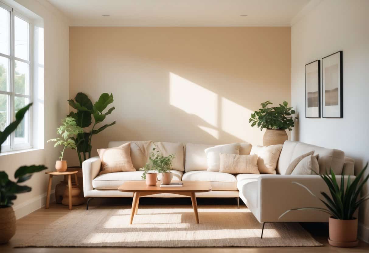
Swiss Coffee by Sherwin Williams works well in many areas of the home. Its soft white paint color creates a balanced backdrop that pairs easily with both warm and cool tones. It can highlight details, brighten spaces, and provide a timeless look without feeling too stark.
Interior Walls and Ceilings
Many homeowners use Swiss Coffee on interior walls because it offers a warm, neutral foundation. Unlike bright white paint, it has a subtle cream undertone that softens the room. This makes it suitable for living rooms, bedrooms, and hallways where a calm atmosphere is preferred.
On ceilings, Swiss Coffee can create a seamless flow with the walls. Some choose to paint both walls and ceilings in the same shade for a uniform look. Others pair it with a slightly brighter white ceiling to add contrast.
This paint color also works well in open floor plans. It provides consistency across connected spaces without clashing with different flooring or furniture finishes. Its versatility makes it an easy choice for those looking for a cohesive design.
Trim, Cabinets, and Woodwork
Swiss Coffee is often used on trim, baseboards, and crown molding. Its soft tone highlights the architectural details without drawing too much attention. When paired with darker wall colors, it creates a clean border that frames the room.
For cabinets, this paint color is popular in kitchens and bathrooms. It gives a classic look that works with both modern hardware and traditional styles. The warm undertone prevents the cabinets from looking too sterile.
Woodwork such as doors, built-ins, or shelving also benefits from this shade. It blends well with natural materials like oak, walnut, and pine. This makes it a practical choice for spaces that combine painted and natural finishes.
Exterior Surfaces
Swiss Coffee is also used on exterior surfaces such as siding, trim, and shutters. Its off-white tone softens the look of a home while still appearing bright in natural light. It works well with brick, stone, and wood accents.
When used on exterior trim, it pairs nicely with darker body colors like gray, navy, or green. This creates a balanced contrast that highlights the home’s details.
Homeowners often choose this shade for front doors, garage doors, and porch railings. It provides a consistent appearance that matches both traditional and modern exteriors. Its adaptability makes it a reliable option for many architectural styles.
Best Sherwin Williams Matches and Alternatives
Swiss Coffee by Benjamin Moore is a popular off-white, but many people look for close options within the Sherwin-Williams line. The main considerations are how the undertones compare, how light the color feels, and which shade works best in different spaces.
Top Sherwin Williams Color Matches
Several Sherwin-Williams colors come close to Swiss Coffee. Alabaster (SW 7008) is one of the most popular alternatives. It has a soft, warm tone that feels similar but slightly lighter.
Shoji White (SW 7042) leans more neutral with a touch of gray, making it less creamy than Swiss Coffee. Greek Villa (SW 7551) is another strong match, offering a warm undertone that stays bright without looking stark.
For those who want a slightly deeper look, Navajo White (SW 6126) can be considered. It has more beige in it, which makes it richer but still in the same family. Each of these colors provides a practical alternative depending on the exact look someone wants.
Comparing Undertones and LRV
Undertones and Light Reflectance Value (LRV) play a big role in how these whites look on the wall. Swiss Coffee has warm undertones with a hint of yellow, giving it a creamy appearance.
Alabaster has a similar warmth but reflects more light with an LRV of 82, making it brighter. Shoji White has an LRV of 74, so it appears more muted and grounded. Greek Villa sits at 84, which means it looks cleaner and slightly lighter than Swiss Coffee.
Navajo White has an LRV of 72, so it reads darker and warmer. These small differences matter when comparing rooms with different amounts of natural light. A higher LRV works well in dim spaces, while lower LRVs can balance very bright rooms.
Choosing the Right Match for Your Space
The right choice depends on the room’s light, size, and style. In spaces with limited daylight, Greek Villa or Alabaster can help the room feel brighter.
For homes with lots of natural light, Shoji White may prevent the walls from looking too yellow. Navajo White works better in traditional settings or when paired with warm wood tones.
It also helps to test samples on the wall. Paint can shift in appearance depending on flooring, trim, and furniture. Comparing swatches side by side with Swiss Coffee makes it easier to pick the closest Sherwin-Williams match.
Tips for Decorating With Swiss Coffee
This warm white paint color works well in many settings because it adapts to different tones, lighting, and design styles. Its soft undertone makes it versatile for pairing with both cool and warm accents.
Pairing Swiss Coffee With Other Colors
Swiss Coffee by Sherwin Williams is not a stark white, so it blends smoothly with a wide range of shades. It pairs especially well with muted earth tones like beige, taupe, and soft gray. These combinations create a calm and balanced space.
For contrast, deeper colors such as navy, charcoal, or forest green highlight the warmth of the paint color. Using these darker accents on trim, furniture, or built-ins adds dimension without overwhelming the room.
In kitchens, Swiss Coffee works well with natural wood cabinets or black hardware. In bedrooms, it can be paired with soft pastels like blush or sage for a more relaxed look. The key is to balance warm and cool tones so the white paint feels intentional rather than flat.
Good combinations include:
- Swiss Coffee + Warm Gray
- Swiss Coffee + Deep Navy
- Swiss Coffee + Natural Oak
Lighting Considerations
Lighting affects how Swiss Coffee appears on walls. In north-facing rooms, the paint color may read slightly cooler, leaning toward a muted off-white. In south-facing rooms, it often looks warmer and creamier.
Artificial light also changes the tone. Warm bulbs can bring out their creamy undertones, while cooler LED lighting can make it look more neutral. Testing swatches on multiple walls helps avoid surprises once the entire room is painted.
Gloss level plays a role, too. A flat or matte finish softens the look, while satin or semi-gloss reflects more light and makes the color appear brighter. Homeowners should choose the finish based on the room’s function and desired effect.
Design Styles That Complement Swiss Coffee
Swiss Coffee suits many design approaches because it is a flexible white paint. In modern spaces, it provides a clean backdrop for sharp lines and minimalist furniture. In traditional homes, it enhances crown molding, paneling, and other details without feeling stark.
Farmhouse and rustic styles benefit from its warmth, especially when paired with wood beams or stone. Coastal interiors also use this shade to reflect natural light and create a relaxed atmosphere.
It also works in transitional spaces, where classic and modern elements meet. By staying neutral, the paint color allows other design features—such as textiles, artwork, or metal finishes—to stand out without clashing.
Frequently Asked Questions
Swiss Coffee by Sherwin-Williams works well in many spaces, but its results depend on finish, primer, and lighting. It also performs differently indoors and outdoors, so application choices matter.
What type of finish is best for Swiss Coffee paint in high-traffic areas?
A satin or semi-gloss finish holds up better in busy spaces. These finishes resist scuffs and are easier to wipe clean compared to flat or matte options.
Can Swiss Coffee be used for both interior and exterior applications?
Yes, it can be applied to both. For exterior use, a high-quality exterior-grade formula is recommended to handle weather exposure.
What primer should be used with Swiss Coffee for optimal coverage?
A white or light gray primer helps the paint cover evenly. This base reduces the number of coats needed and keeps the color looking consistent.
How does lighting affect the appearance of Swiss Coffee paint on walls?
Natural light can make the color look warmer and slightly creamier. Under artificial light, it may appear more muted or neutral depending on the bulb type.