
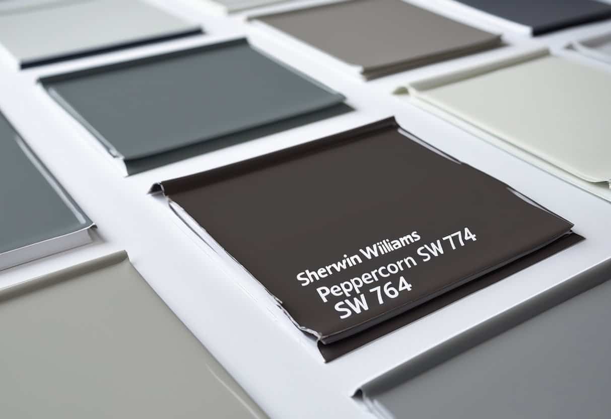
Sherwin Williams Peppercorn (SW 7674) is a deep gray paint color known for its balance of boldness and versatility. It offers a strong presence without overwhelming a room, making it a popular choice for both modern and traditional spaces. Its appearance can shift depending on lighting, which adds to its appeal and adaptability.
This shade works well in a variety of settings and can be paired with many other colors to create different effects. Understanding its undertones and how it interacts with light helps homeowners and designers use it with confidence in different parts of the home.
Key Takeaways
- This color offers a bold yet balanced look.
- It pairs well with a range of other shades.
- Lighting changes its appearance in each space.
What is Sherwin Williams Peppercorn?
Sherwin Williams Peppercorn (SW 7674) is a dark gray paint color that sits between black and true gray. Many consider it a soft black because it has depth without feeling overly harsh. This makes it versatile for both modern and classic interiors.
Designers often use Peppercorn paint color on walls, trim, cabinets, and even exterior surfaces. Its rich tone brings definition and contrast while still feeling refined.
Light Reflectance Value (LRV)
The Light Reflectance Value (LRV) of Peppercorn SW 7674 is 10. This means it reflects only 10% of light, placing it on the darker end of the scale.
| Paint Color | LRV | Tone Category |
|---|---|---|
| SW 7674 Peppercorn | 10 | Dark Gray / Charcoal |
| Neutral Mid-Gray | ~50 | Medium |
| Bright White | ~85-90 | Very Light |
Because of its low LRV, Peppercorn can make a small or dimly lit room feel more enclosed. In contrast, larger rooms with plenty of natural light allow the color to appear bold but not overpowering. Many homeowners use it as an accent shade on one wall, doors, or cabinetry to avoid overwhelming a space.
Color Undertones
Peppercorn paint color has a neutral gray base, but subtle undertones may appear depending on the environment. In some lighting conditions, it can reveal faint hints of blue or purple. These undertones are not dominant but can shift the mood of a room slightly.
Because undertones vary with light, designers recommend testing samples on multiple walls and observing them throughout the day. Peppercorn pairs well with both warm tones (like beige or cream) and cool tones (such as crisp whites or lighter grays), making it flexible for different palettes.
Effect of Lighting
Lighting plays a major role in how Peppercorn SW 7674 looks in a space.
- North-facing rooms: the color leans cooler, showing more of its gray side.
- South-facing rooms: it softens and can appear slightly warmer.
- Artificial lighting: LED bulbs may highlight cooler tones, while incandescent bulbs can bring out a warmer cast.
Natural light also changes the feel of the color throughout the day. Morning light may make Peppercorn look lighter and softer, while evening light can deepen its charcoal appearance. Testing it under different light sources helps ensure it works in the intended setting.
Colors that Work Well with Peppercorn (SW 7674)

Strong Accent Shades
Peppercorn (SW 7674) creates a bold base that pairs nicely with rich, saturated colors. Deep greens, navy blues, and dark reds bring out its depth and add a sense of contrast. These combinations often look best in rooms with good natural light, as the brightness helps balance the darker tones.
To prevent the space from feeling too heavy, designers often add lighter accessories. Items such as white throw pillows, light gray rugs, or neutral artwork can soften the overall look. This mix of bold and light elements keeps the room balanced while still highlighting Peppercorn’s modern character.
| Accent Color | Effect with Peppercorn | Suggested Use |
|---|---|---|
| Deep Green | Earthy and grounded | Furniture, trim |
| Navy Blue | Classic and refined | Accent wall, textiles |
| Dark Red | Warm and dramatic | Artwork, décor pieces |
Crisp Whites and Soft Creams
Pairing Peppercorn with whites and creams creates a clean and timeless look. A sharp white, such as Sherwin Williams Extra White (SW 7006), offers a crisp contrast that feels fresh and modern. This combination works well in kitchens, bathrooms, and entryways where a bright, airy feel is desired.
Creamier shades can also work, but they need to be tested alongside Peppercorn to avoid undertones that may clash. When chosen carefully, these softer whites bring warmth and prevent the space from feeling too stark.
- Extra White (SW 7006): sharp and modern contrast
- Cream tones: softer, warmer pairing
Cozy Neutral Tones
Warm neutrals bring balance and comfort when used with Peppercorn. Shades like beige, tan, or light brown soften its intensity and create a welcoming atmosphere. A popular choice is Accessible Beige, which blends seamlessly with Peppercorn to form a grounded and inviting palette.
These combinations work especially well in living rooms, bedrooms, or any area where a relaxed mood is preferred. Natural light enhances the warmth of the neutrals, making the space feel open and balanced.
- Beige and tan tones add softness
- Light browns create a natural, earthy feel
- Accessible Beige offers a reliable pairing for versatile spaces
Comparing Peppercorn With Other Paints
Peppercorn vs. Iron Ore
Sherwin Williams Peppercorn and Iron Ore both fall into the deep gray category, but they create different moods. Iron Ore leans darker and carries a subtle warmth, while Peppercorn feels a bit softer and more balanced.
Designers often choose Iron Ore for modern or industrial spaces where a bold, dramatic tone works well. Peppercorn, on the other hand, adapts easily to both classic and contemporary interiors.
| Feature | Peppercorn | Iron Ore |
|---|---|---|
| Depth | Medium-dark | Very dark |
| Undertone | Neutral gray | Warm gray |
| Best Use | Flexible across styles | Stronger in modern designs |
Comparable shades include Benjamin Moore Wrought Iron and Behr Cracked Pepper, which share a similar richness but vary in undertone.
Peppercorn vs. Urbane Bronze
Urbane Bronze has a stronger brown influence, giving it an earthy, grounded look. Peppercorn stays closer to a clean gray, making it more versatile with both warm and cool palettes.
When aiming for a cozy or natural atmosphere, Urbane Bronze often works better. For a balanced gray that pairs well with a wide range of furnishings, Peppercorn tends to be the stronger option.
- Urbane Bronze: Rich, brown-gray, warm and inviting
- Peppercorn: Neutral gray, adaptable and crisp
Designers often compare these with Benjamin Moore Kendall Charcoal, which sits between the two in tone and depth.
Peppercorn vs. Grizzle Gray
Grizzle Gray is lighter and slightly warmer than Peppercorn, making it a good choice when a softer look is preferred. Peppercorn offers more depth, which makes it stand out on accent walls or bold features.
Grizzle Gray often appeals to those who want a gentler gray for traditional homes. Peppercorn tends to shine in more modern or transitional spaces where contrast is important.
| Feature | Peppercorn | Grizzle Gray |
|---|---|---|
| Depth | Dark gray | Medium-dark gray |
| Undertone | Neutral | Warm gray |
| Best Use | Bold accents, feature walls | Softer, traditional interiors |
Other close comparisons include Sherwin Williams Gauntlet Gray, which sits between these two in both tone and intensity.
Where Can You Use Peppercorn in Your Home?
Accent Walls
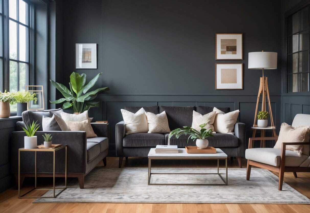
Peppercorn works well for accent walls because its deep tone adds contrast without overwhelming the room. It looks best in spaces with natural light or architectural details that draw attention. To balance the darker shade, many pair it with light furniture, pale rugs, or sheer curtains. Adding mirrors or metallic accents can also help reflect light and prevent the wall from feeling too heavy.
Quick Tips for Accent Walls:
- Use on one wall only for balance
- Pair with soft neutrals like light gray or cream
- Add reflective elements such as glass or chrome
Kitchen and Bathroom Cabinets
This shade is a popular choice for cabinets, especially when combined with lighter surroundings. A Peppercorn island against white perimeter cabinets creates a clean yet bold contrast. Hardware in brass, chrome, or matte black complements the color well. Natural wood counters or shelving also soften the look, making the finish feel warm and inviting.
Peppercorn’s dark gray also pairs beautifully with modern bathroom fixtures, creating a sleek and cohesive design. For an example of hardware that can enhance a bathroom’s style, check out our Shower Wow review, which highlights a fixture that complements bold, contemporary wall colors.
This shade also shines in bathrooms, especially when paired with sleek fixtures and modern finishes. If you’re considering upgrading your bathroom setup, our best bathtub reviews guide can help you choose a centerpiece that complements Peppercorn’s dark gray elegance.
| Cabinet Color | Countertop Pairing | Hardware Finish |
|---|---|---|
| Peppercorn | White or marble | Brass/Chrome |
| Peppercorn | Butcher block | Matte Black |
Dining Spaces
Using Peppercorn in a dining room can create a refined backdrop for both casual and formal meals. Its depth enhances the look of light oak as well as dark walnut tables, making furniture stand out. Lighting plays a key role here—pendant lights or chandeliers highlight the color and add dimension. Rooms with strong daylight or layered lighting work best, as they keep the space comfortable without feeling dim.
Lighting Ideas for Dining Rooms:
- Overhead chandelier for shadows and highlights
- Wall sconces for added warmth
- Natural light emphasized with sheer drapes
Exterior Updates
Sherwin Williams Peppercorn exterior paint gives a modern yet timeless look. It works well on front doors, trim, or full siding, depending on the style of the home. The shade pairs nicely with light brick, dark brick, or natural stone. Testing large samples outdoors is important, since sunlight changes how the color looks throughout the day. Considering the surroundings, such as neighboring homes and landscaping, ensures the exterior feels cohesive.
Ways to Use Outside:
- Front door for a bold entry
- Trim for contrast against lighter siding
- Full exterior for a dramatic, modern style
Closing Notes

Peppercorn stands out as a shade that adapts well to different settings. It works with both natural and artificial light, making it flexible for daily use.
When applied, it can serve as a strong accent or a balanced backdrop. Many find it effective in kitchens, living rooms, and even exterior projects.
Key reminders:
- Test in various lighting
- Pair with complementary tones
- Observe changes throughout the day
This thoughtful approach helps ensure the color fits the intended space.
Frequently Asked Questions
Does Sherwin Williams Peppercorn Lean Warm or Cool?
Peppercorn is considered a balanced gray that does not fall strongly into either the warm or cool category. Its appearance shifts depending on the type of light in the room.
- Natural light: may highlight cooler undertones
- Artificial light: can bring out a softer, warmer look
This flexible quality makes it suitable for a wide range of styles and spaces.
Which Color Is Slightly Lighter Than SW Peppercorn?
The next lighter shade on the same strip is Grizzle Gray (SW 7068). It shares the same depth of character but appears less intense.
| Color Name | Code | Tone Description |
|---|---|---|
| Peppercorn | SW 7674 | Deep, versatile gray |
| Grizzle Gray | SW 7068 | Softer, lighter gray |
Designers often recommend using Grizzle Gray when a room needs a similar mood as Peppercorn but with a touch more brightness.