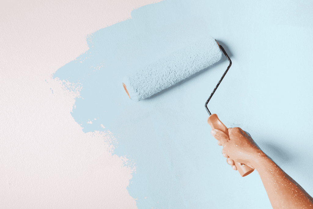
If you’ve been hunting for the perfect paint color that’s calm, versatile, and timeless, you’ll love Sherwin Williams Upward (SW 6239). This soft, airy blue with subtle gray undertones has become one of my go-to shades for creating spaces that feel both stylish and soothing.
In this guide, I’ll break down exactly why Upward works so well, how to use it in your home, the best pairings, and how it stacks up against other similar blues. Let’s dive in.
Why This Color Stands Out
1. Soft, Balanced Blue
Upward isn’t your typical “nursery blue.” Instead, it’s a sophisticated mix of blue with a whisper of gray. That balance prevents it from feeling too sweet or overwhelming. The result? A color that’s calming without being boring.
In fact, I’ve seen clients literally relax the moment this shade went on the wall. That’s the subtle power of balance at work.
2. Chameleon-Like Versatility
The beauty of Upward is its ability to adapt. In coastal homes, it plays well with driftwood and crisp whites. In modern farmhouses, it pairs beautifully with black fixtures and reclaimed wood. Even in urban lofts, it adds just enough color without clashing with industrial design.
Bottom line: no matter your style, this color finds a way to fit in.
3. Master of Light
What really makes Upward unique is how it reacts to light. Morning sun warms it up with a hint of periwinkle, midday brings out its neutral blue, and evening transforms it into a cozy gray-blue. It’s like getting multiple colors in one—without ever repainting.
Best Places to Use Upward
Bedrooms & Bathrooms
This color is tailor-made for creating a serene retreat. In bedrooms, it feels cloud-like and restful. In bathrooms, it pairs effortlessly with white tile and chrome fixtures, giving you a spa-like atmosphere.
Living Rooms & Common Areas
Upward shines in larger spaces, too. It somehow makes open-concept layouts feel expansive yet cozy. Bonus: it’s a fantastic backdrop for art, furniture, and statement lighting.
Exteriors & Front Doors
Want curb appeal that’s subtle but memorable? Try Upward outside. On siding, it’s sophisticated and timeless. On front doors, it makes an instant statement—neighbors will notice.
Perfect Pairings
Trim Colors
- Pure White (SW 7005): Crisp contrast without harshness.
- Extra White (SW 7006): Softer, more cloud-like transition.
Accent Walls
- Naval (SW 6244): Adds dramatic depth.
- Distance (SW 6243): For a tonal, layered look.
Metallic Finishes
- Brushed nickel = modern sophistication
- Oil-rubbed bronze = traditional warmth
- Matte black = bold, contemporary
Coordinating Colors
- Neutrals: Pure White (SW 7005) and Agreeable Gray (SW 7029) keep things grounded.
- Bold Accents: Naval (SW 6244) or Tricorn Black (SW 6258) for modern edge.
- Soft Complements: Sea Salt (SW 6204) and Rainwashed (SW 6211) create a serene, coastal palette.
How It Compares to Similar Blues
- Misty (SW 6232): More gray, less vibrant.
- Benjamin Moore Horizon (OC-53): Cooler and more reserved.
- Upward: Warmer, livelier, and more adaptable in shifting light.
If you want a blue that feels calm but has personality, Upward is usually the winner.
Real-World Feedback
Clients rave about this shade. From authors who say it sparks creativity to B&B owners who report more bookings thanks to Instagram-worthy walls, the feedback is consistently positive.
The only caveat? Upward is sensitive to light. Test it in your space before committing—especially in rooms with tricky lighting.
Final Thoughts
Sherwin Williams Upward (SW 6239) is one of those rare shades that manages to be trendy and timeless, calming and versatile. It works in bedrooms, living rooms, exteriors—you name it. Pair it with the right trim, accents, and textures, and you’ll have a look that feels fresh for years to come.
If you’re looking for a blue that adapts, inspires, and enhances nearly any space, Upward deserves a serious spot on your shortlist.
